Hold & Heal
A UX Case Study on Compassionate Wellness App for the Caregivers
Tools used
Role
End-to-End Designer
Figma

The Effort No One Sees
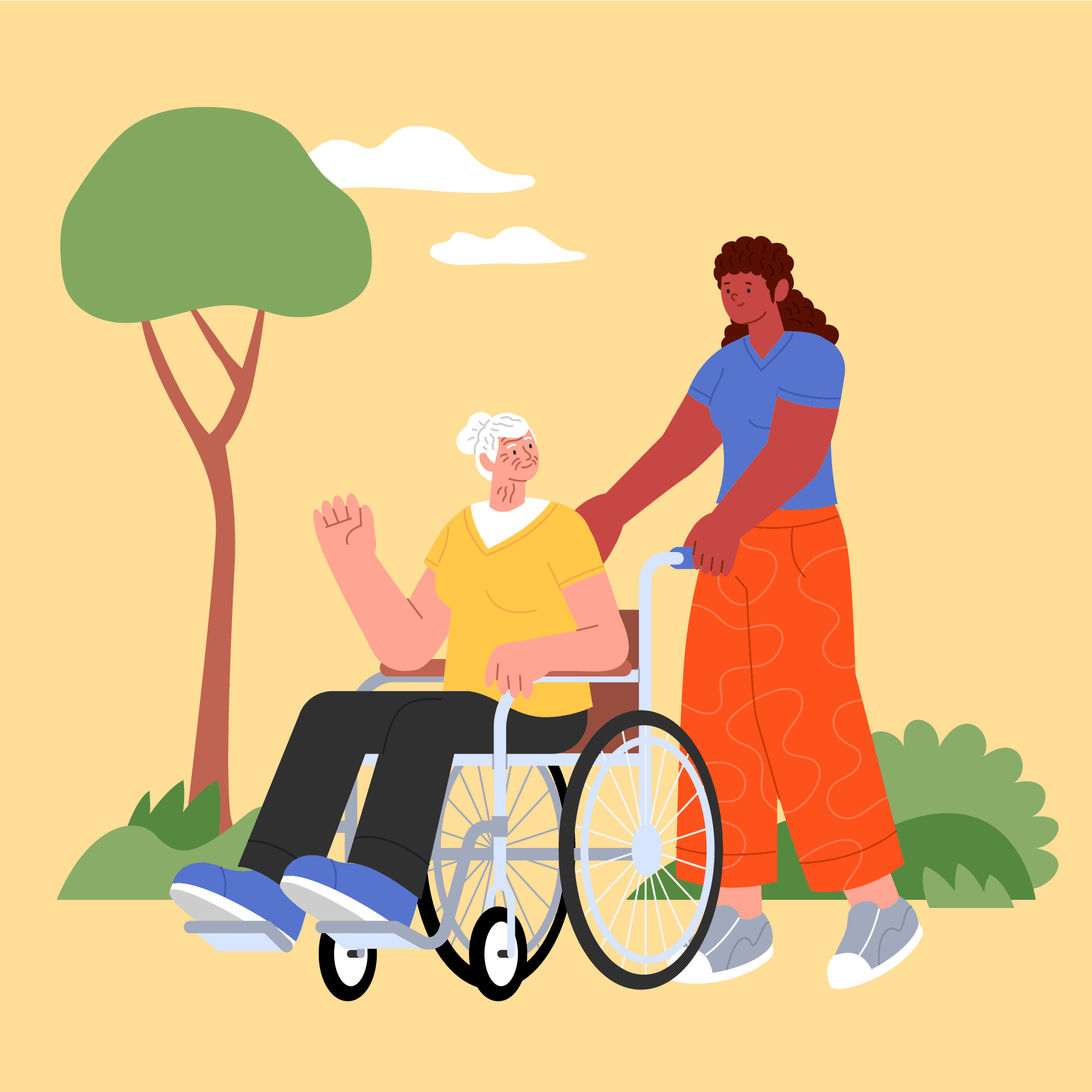
The family member who left work early because there was no one else. Who figured out medications by Googling at midnight. Who chose to do it alone not because they had to, but because it was their person and they weren't handing that to a stranger.
And the professional caregiver managing multiple patients, multiple families, multiple sets of vitals carrying the weight of other people's most vulnerable moments every single day.
Different lives. Different needs. One thing in common nobody designed anything for them.
This project started with one person I observed. It became a design system built around everyone like him.
The Origin
I didn't find this problem in a brief or a design challenge. I watched it happen.
A relative of mine became the sole caregiver for his mother unexpectedly, without training, without backup. One afternoon he was at work. She refused to eat and started getting distressed. He had no one to call, no system in place, no way to handle it remotely. He left everything and went home.
That moment stayed with me. Not because it was dramatic but because it was so ordinary. This is what caregiving actually looks like for most people. Unglamorous, isolating, and completely unsupported by any tool that exists.
Two things struck me most
There was no one to notify. Not a hired professional, not a family member nearby. Just him, alone, managing everything.
He didn't want a stranger involved. He was drowning but it was his mother. The pride and the exhaustion existed in the same breath. No app accounted for that complexity.
Those two observations became the foundation of every design decision in Hold & Heal.
Unheard Voices
Instead of generic research metrics, I chose to highlight the raw, unfiltered emotions of caregivers because sometimes the deepest insights come from voices we rarely hear.
Reflection
The hardest design decisions in Hold & Heal weren't visual, they were philosophical.
Remove mood tracking. No forums. An emergency screen that doesn't panic. Every decision came from one question does this actually serve the person, or does it just look like it does?
Version 1 had 5 screens and good intentions. Version 2 has 9 screens and a reason behind every pixel.
I now know the difference between designing something that looks like empathy and something that actually practices it.
That difference is everything.
Design

A walkthrough of the features that power support, ease, and empathy
A wellness companion app for family caregivers, the people caring for someone else while quietly falling apart themselves.
Problem: Caregivers are the most overlooked users in health design. No app exists for their emotional survival only their duties.
My role: End-to-end concept design, user research, information architecture, visual system, beginner and professional experiences in Figma.
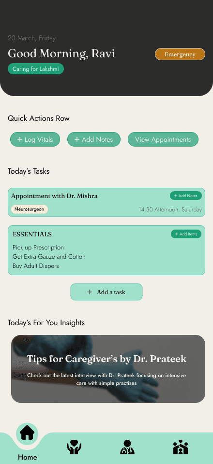
Key decision: Designed for stolen minutes, not dedicated sessions. Because caregivers don't have an hour, they have 3 minutes while the kettle boils.
Honest outcome: Fully rebuilt with stronger thinking, a clearer user, and a reason behind every decision. This is the project that grew with me the most.
Summary Card
Designing the moment caregivers switch from caring for others to caring for themselves.
Hold & Heal is a caregiver companion app built for two very different people doing the same exhausting job.
Key Decisions
Onboarding shapes everything
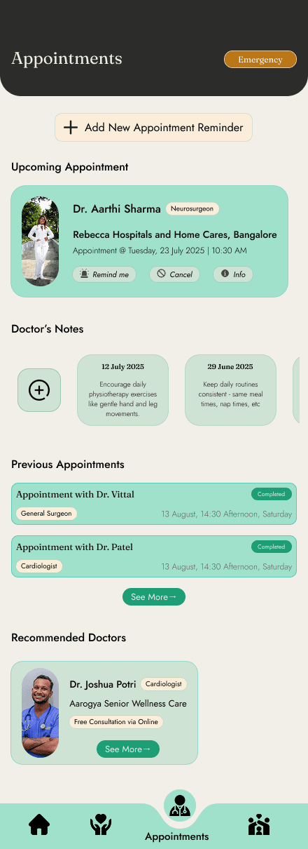
Four questions at the start fundamentally change what the app becomes. Family caregiver or professional one answer unlocks different features, different complexity, different experience. The app doesn't ask you to configure settings. It just becomes what you need.
Rejecting mood tracking
Caregivers don't have one mood a day. Asking them to pick an emoji for grief, relief, guilt and exhaustion all before 10am felt reductive. Hold & Heal pays attention differently through passive signals and gentle nudges, never a daily mood picker.
No forums. Ever.
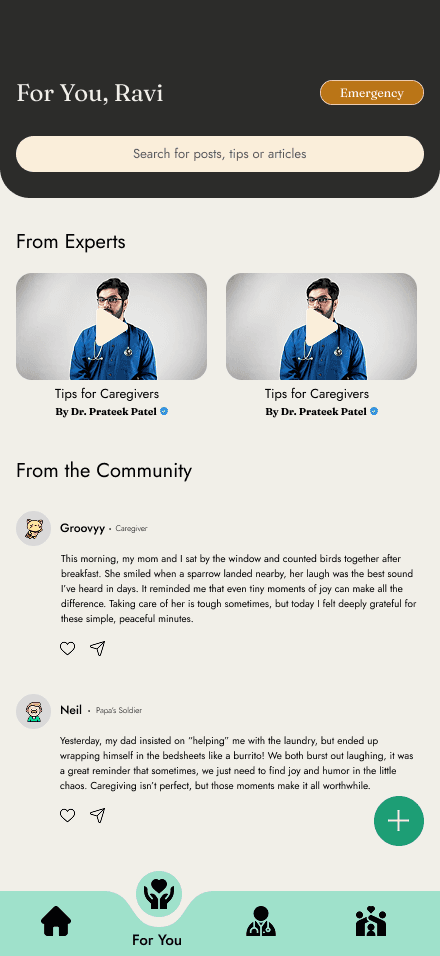
Forums require energy caregivers don't have. The community here is anonymous posts, an "I felt this too" tap, no usernames, no pressure. Just quiet solidarity.
One app, one exhausted person
The same person logging vitals is the same person who needs 2 minutes to breathe. Hold & Heal holds both without making either feel like an afterthought.
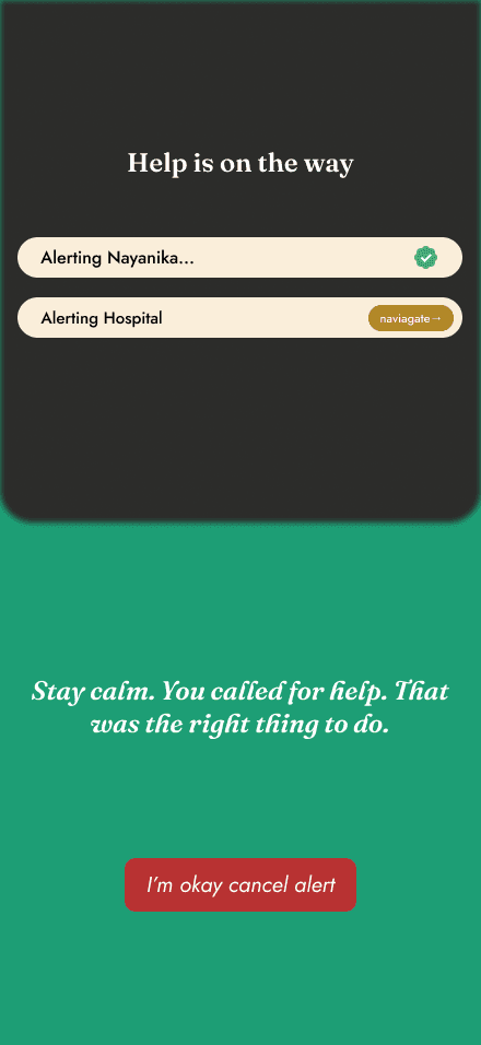
The emergency gesture
Help should never be more than one action away from any screen, at any moment. And when they trigger it, the app doesn't panic with them. It says "Stay calm. You called for help. That was the right thing to do."
